Showing posts with label Residential. Show all posts

23.11.07

When A Night Shot Isn't Exactly Night

It's actually (supposedly) dusk. This project was done quite some time back. The design had been finalized, and we needed a "hero" shot that would show the buildings uniqueness in some way. I guess the Architect knew as well that the design was not much special from any other building, except that it had these "special" windows. So to emphasize on these, was to have it rendered as a night shot. Of course, the tricky part was to show the building's form as well, and as requested by the developer.

So to create the illusion of a night shot, 3d omni lights were thrown into the interior scene, while maintaining a considerable amount of GI to light the exterior. An overall grading of bluish tone and colour adjustment was done as to get the look i perceived was nice. To further enhance the effect, I had to pick a relatively complimenting sky and background as well.

In summary, I was trying to simulate a shot taken at dusk (via color correction as to get that "night" effect without losing too much details), and at the same time creating silhouettes as to frame the building.

Tech Notes:
Modeled with 3D Max 7.0
Rendered with Vray
Post-Processed in Photoshop CS

5.10.07

Simplified (A different approach to lighting)

Okay, so it's been ages since I've had any updates here. Lotsa..lotsa stuff "cooking."
Anyway, I'd like to present a recent work wherein I approached the lighting of the scene in a not-so-typical manner. The scene in question is an interior of some loft. The project required a draft render to be done quickly. Problem was only the architectural walls were given. In cases like these, I'd go for the "minimalist" approach. Minimalist not only in terms of the look, but also the way of setting up a "nice" scene.

First, the 3d model has to be strategically built (as only can be seen), so that a couple of camera angles can be set-up to show spaciousness. Then, it had to be furnished so that it the client would be able to relate to the scale of the space and picture composition (don't assume people can easily imagine things in an empty room even). Finally, it had to lit-up as to clearly show some mood or effect.

The first few steps are typical to most 3D artists. However, the method of using a Vray light sphere is not usual to probably most. This, as I'd think is like really having a sun (instead of the Vray Sun, or Direct-light or numerous vray light planes). The tricky part would be positioning it as if it were an huge Omni light. And this would also affect the way the shadows would turn out.

The final process, would be the enhancing of the image in Photoshop. To create different moods with different light positions and settings (although not difficult) can be simplified further by just sticking to one light position. To create the illusion of different times of the day, adjustments to colour filters would do the "trick."

Render settings, and light position / set-up are the same for the above images in different cameras. Notice that the shadows are the same, I simply "added" different colours and background to have a slightly different effect.

  • Tech Notes:
  • Modeled with 3DS Max v8.0
  • Rendered with Vray, Ambient Occlusion via Vray plugin
  • Post processed in Photoshop

24.5.07

Ingenious Arrogance You Say?!

Crazy, spectacular, ingenious, insane and daring. I'm referring to the designs some local Architects here in Singapore are coming up with nowadays. Putting aside the other high profile developments, it still amazes me that there are other developments out there (or to be launched) that just challenge the norm.

Imagine... a high-rise development where you can park your car just next to your living room. Well, I guess it's meant for those filthy rich folks who just don't only want to own a classy place and some fancy car, but who also wants to show it at the same time.

And that's where you really put into context the answer to this question ,"why?"

Their answer: "...simply because we can!"

And so as for this image, I was just messing around with a last minute job I had to work on. I came in at the "lighting stage" only. The client wanted to have some focus on the car being smacked right next to the living area (as intended as well by the Architect). My solution, was to make the lighting at the car brighter of all areas. With the limited time as well, I had to cut down the reflections and minimize glossiness levels so it would render like "now."

This is not the final image the client requested. It's just my interpretation, a quick-wit of some sort as to come up with an Ad and Tag line for a rather "incomplete" render. Not only for fun....
but simply because...I can.


Tech Notes:

With all the initial high reflections, the image took ages to render. So reflection depth was cut way too low to 3.
I would have rendered in passes, but it would take me longer than required still. The drawback was almost no reflection for the car at the ceiling which is supposed to be a mirror. Other elements get reflected sharply while the car doesn't. (I have yet figure out why). Blurring was done in Photoshop, via Radial blurred and comped with the sharp image.

19.1.07

Moving without walking...

...it's either you gotta be running, in a car, or flying. In this case flying. As in a "fly-thru" (or walk-thru) animation.

Initial brief of the project: The client wanted to see shots of various areas of the development. And it was suggested that we based it on the still (hi-res) images that we had given much earlier.

I came in later as to help amend part of the 3D model, light-up and do texturing...all these so that we could come up with these hi-res images. As soon as it was confirmed that an animation had to be done, it was my job to "finish" this animation within a month -- composed roughly of 10+ shots, 2 minutes length, and lotsa-lotsa render times -- almost all by myself. (Aaaaargh! Had they given me this responsibility a few years back, I would have probably fainted straight away.) Good thing, experience taught me to look-up for possible hiccups and problems that must be taken care of even before starting to work on the model, and Previz animation. Advice with the "master chief" as well was taken in consideration.

To start of with, I had to optimize the 3D scene as to come up with shorter render times. This included cutting-down on unnecessary 3d models, making use of vray proxies, and minimizing high reflection / glossiness settings. The tricky part to this was not to over-compromise on the 3d model as to gravely affect the look of the images.

I also had to set-up simple the camera paths for the shots. What I had in mind was nothing fanciful and yet it wouldn't just involve simple wipes and cross-fades from one shot to the other. I wanted it to look like there was a natural flow from one space to the other,rather than a montage of some sort.

By the time I gotten some feedback and notes on what to amend, it was rather easy (but still tedious!) for me to work on the model due to the preparation I had done earlier. And it was good that some of the elements could be rendered in a separate pass and/or added in AfterEffects later. The images are screenshots of the final animation.


Addt'l Tech note: Most of the elements are 3D created in 3dsMax. To easily render, plants were converted as well into vray proxies. The "custom" background was prepared in Photoshop and mapped onto a sphere -- rendered separately. Some foreground elements were either a separate render or simply "blurred-out" 2D images composed in AE.
Compositing: Adobe After Effects (AE)
Editing: Adobe Premier
Rendered with Vray @ 3DsMax

1.12.06

Finding the "Perfect" view

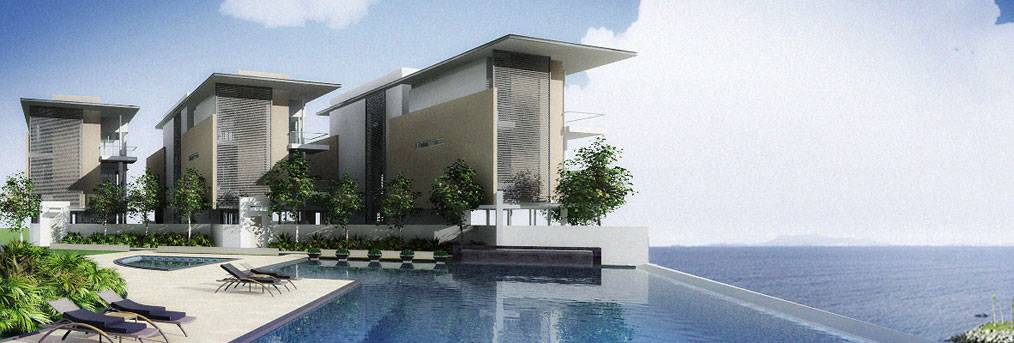
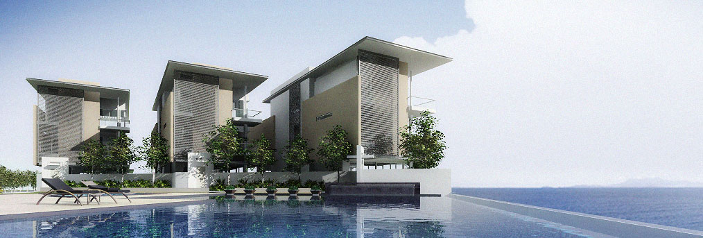
I guess it's just one of those days. This project partly involved a shot of three villas by the pool. The tricky part was to find a appealing shot that could showcase the architecture, and at the same time really focus on the three structures.

First shot, is rather composed in a way wherein the subject was about two-thirds in frame. And the horizon was just about 1/3 down. (Following the "rule" of 3rds.) Of course, I also had to make sure to give that 3-dimensional effect by at least showing two sides of the structures. And since it was a development to showcase, I figured to show some of the pool area as well.


Second shot, was approached as to make the structures really come at the viewer. To achieve this effect was to really use a virtually wide angle lens and get as close as possible to the subject. And I thought it would be nice to really give the feeling, as if one were viewing it from inside the pool. However, the drawback of this shot was that it created some "clutter" where by the lower-left side of the image where the chair and plants converge.
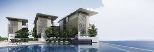
Personally, I preferred the 2nd shot. And I think, I could remove this "clutter" by adjusting the chairs and plants. But alas, this shot was rather "controversial." And to consider it artistic is subjective indeed. In the end, the client (like the majority) was more comfortable, and was drawn to the 1st shot. Nevertheless, I was satisfied that it took really sometime for some to consider the "best" image.


...so, the moral of the story is "you win some....you lose some." But at least dare to do the unusual, because "safe" can sometimes be "boring." (not that the 1st image was boring!)

Tech note: These images were simply "draft" renders. Lit in 3ds max, and rendered with Vray using one Direct Light. Some quick colour correction, brightness and contrast adjustment and background replacement were also done in Photoshop. -- only for "preview" purposes.