Showing posts with label Interior. Show all posts

11.8.14

2014 Mid-year Update!

Check-out -- > Visualization Gallery in CG Architect

2014 ... Still at it! Do people blog still nowadays, really?! I guess in this fast-paced age of digital web content -- it's like twitter, youtube, and vimeo. 

Please feel free to view my latest animation reel , by clicking here.


7.2.13

2013...blog revisited

It's been  about 4 years now since I've written...
...and am still at this -- pursuing this "Art." Of course, there weren't all easy days, but I couldn't back down just easily. So much I have lost, besides time - and certainly, there's that silver lining.

For sure, one thing I have learned -- what goes around, comes around. Though many instances apply to this saying with relevance in the course of my journey, I would rather mention the good ones.

Back in 2008, I had to leave the fellas at Lights&Shadows - the company which kinda jump-started my career in this 3d/CGi. It was all good when we parted ways, and I had as well developed a certain friendship with them beyond just work. And so, as I had left, I went about doing other stuff...thru ups and downs...and eventually setting-up Lucid Render

Lucid Render (or simply Lucid), is my first venture - of a "hobby" turned full-time job. It's tough. And being solo on it, does takes its toll and tires me. The joy of doing things for myself and yet the stress of "surviving" can be daunting at times..to the point of giving up...

...to cut the story short, I couldn't focus much on the "way I want Lucid to be"; and I have in a way missed the interaction with other artists. And destiny leads me, I end up back with Lights & Shadows.

...I come back, better, bolder,...a tad bit wiser perhaps. BUT in having still in mind - I could still be much better...

there's just to much to do, to work on..and yet to achieve.


18.1.08

News of Old for the New

Back again for 2008. Last year was a very intense year for CG work, especially the last month. And things are still on the roll. Major things in the making still. Hence, the reason why I haven't been able to post much on this blog. However, for posting's sake, Autodesk has recently released some news regarding some stuff about company I work in (Lights & Shadows). Something worth sharing...


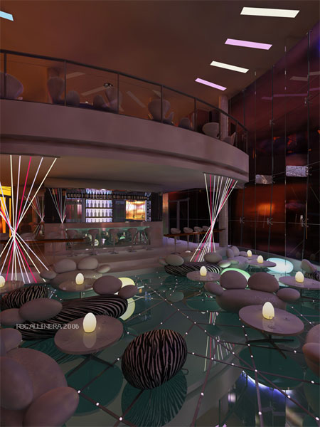
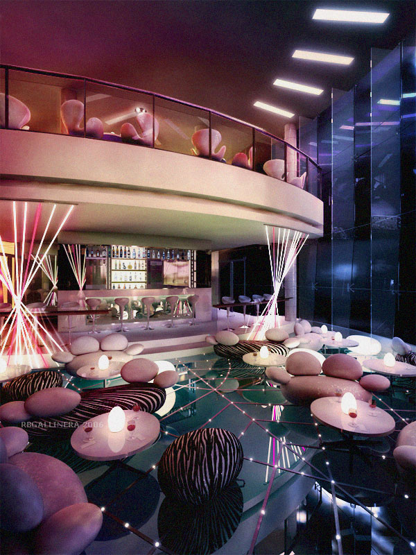
Bar counter at some resort development at Koh Samui


A grand plan, The Capella at Sentosa

Press release as seen here.

Just to note, neither I or any of us in LNS did not pick the above images. I'd say there were other "impressive" works to choose from as well. So it was quite a suprise, for at least the 1st image, to make it. To add, though I was mainly involved in these, I have still to commend a few of my colleagues who have played a part on these as well.

1st Image: 3D modelling was mostly done by me, including Photoshop enhancement. I'd say, the fun part of working on this was creating my own library of bottled liquors. It was more of collecting actual labels and replicating the bottle's shape in 3D. In a way, I got educated in the art of drinking wine and mixing cocktails.

2nd Image: This was a very tough thing to make. Again, major involvement in 3D on my end. The main building was rather typically modelled. And I had to copy the existing colonial house in which the new development was designed around it as well. What i found difficult was making the land contour / slopes. Literally done via edit-poly...pushing and pulling vertices / adding polygons as I traced along the plan. And a major role, was the 2D enhancement my our DI Artist. Without the surrounding and trees / colour adjustments...it just wouldn't have looked right.

Other Credits & Tech Notes:
Chua T.Y. (Main Adviser...MasterChief)
Additional 3D model in Max / Support (for The Capella): Xiao Lei, Chua T.Y.
2D DI in Photoshop (for The Capella): Alice Lee

5.10.07

Simplified (A different approach to lighting)

Okay, so it's been ages since I've had any updates here. Lotsa..lotsa stuff "cooking."
Anyway, I'd like to present a recent work wherein I approached the lighting of the scene in a not-so-typical manner. The scene in question is an interior of some loft. The project required a draft render to be done quickly. Problem was only the architectural walls were given. In cases like these, I'd go for the "minimalist" approach. Minimalist not only in terms of the look, but also the way of setting up a "nice" scene.

First, the 3d model has to be strategically built (as only can be seen), so that a couple of camera angles can be set-up to show spaciousness. Then, it had to be furnished so that it the client would be able to relate to the scale of the space and picture composition (don't assume people can easily imagine things in an empty room even). Finally, it had to lit-up as to clearly show some mood or effect.

The first few steps are typical to most 3D artists. However, the method of using a Vray light sphere is not usual to probably most. This, as I'd think is like really having a sun (instead of the Vray Sun, or Direct-light or numerous vray light planes). The tricky part would be positioning it as if it were an huge Omni light. And this would also affect the way the shadows would turn out.

The final process, would be the enhancing of the image in Photoshop. To create different moods with different light positions and settings (although not difficult) can be simplified further by just sticking to one light position. To create the illusion of different times of the day, adjustments to colour filters would do the "trick."

Render settings, and light position / set-up are the same for the above images in different cameras. Notice that the shadows are the same, I simply "added" different colours and background to have a slightly different effect.

  • Tech Notes:
  • Modeled with 3DS Max v8.0
  • Rendered with Vray, Ambient Occlusion via Vray plugin
  • Post processed in Photoshop

24.5.07

Ingenious Arrogance You Say?!

Crazy, spectacular, ingenious, insane and daring. I'm referring to the designs some local Architects here in Singapore are coming up with nowadays. Putting aside the other high profile developments, it still amazes me that there are other developments out there (or to be launched) that just challenge the norm.

Imagine... a high-rise development where you can park your car just next to your living room. Well, I guess it's meant for those filthy rich folks who just don't only want to own a classy place and some fancy car, but who also wants to show it at the same time.

And that's where you really put into context the answer to this question ,"why?"

Their answer: "...simply because we can!"

And so as for this image, I was just messing around with a last minute job I had to work on. I came in at the "lighting stage" only. The client wanted to have some focus on the car being smacked right next to the living area (as intended as well by the Architect). My solution, was to make the lighting at the car brighter of all areas. With the limited time as well, I had to cut down the reflections and minimize glossiness levels so it would render like "now."

This is not the final image the client requested. It's just my interpretation, a quick-wit of some sort as to come up with an Ad and Tag line for a rather "incomplete" render. Not only for fun....
but simply because...I can.


Tech Notes:

With all the initial high reflections, the image took ages to render. So reflection depth was cut way too low to 3.
I would have rendered in passes, but it would take me longer than required still. The drawback was almost no reflection for the car at the ceiling which is supposed to be a mirror. Other elements get reflected sharply while the car doesn't. (I have yet figure out why). Blurring was done in Photoshop, via Radial blurred and comped with the sharp image.

2.4.07

La Viva...Vivo City!

It's more than mid-way thru the Fashion Festival here in Singapore.
And it's almost half a year since I worked on something relating to this -- Vivo City (the background for the Vivo City ad posters).

For that mentioned project, we had to work closely with the ad agency who already had conceptualized the look. It was also a different kind of visualization. We were given the freedom to create an impression of the Vivo City mall -- and not to really follow the architectural detail to the dot. And the final image would be "muted" in a monochromatic tone as to help focus the view to the model in the foreground later.

This project also brought me back closer to my "Architectural" roots. I basically was given a rough sketch and plan. Then from there, I would design and "build" it in 3D.
There are about 7 posters or so that we got to work on. But, I figured I'd just show this one.

From concept to execution. It starts from the drawing by the Ad agency.


I couldn't find the actual poster for this particular shot. But if you happen to be in Vivo City, it won't be hard to miss.

Here's just the background which I worked on. Quite few more details were actually changed and added for the actual poster, besides the monochromatic adjustment.


Tech Note:
Modeled and rendered in 3Ds Max 8.0 with Vray.

Brief scene description:
One Direct light from above, thru the skylight.
A few number of customized maps (photos of shopfronts) were used as textures instead of building it in 3D.
It was also more of an "artistic" call when it came to how sharp or visible the reflections were.
Of course, the final ad print would have also been handled by another DI Artist -- as for colour and image enhancement.

4.4.06

Render without Lights...(almost)

...it can be done. But also depending on some situations or whatever effect you may be after. In this case, I had the "luck" of using an HDRI which was available from Paul Devebec's Site.
The project (in LNS) at hand was some bar / lounging area. The design was modern and incorporated some sleek lighting fixtures, and lots of glass. And this is one type of project that required to show this concept, and yet set it in a night effect.

This pass is basically using most of the GI settings and environment to light up the place. No lights were place just yet. The supposedly light fixtures were simply made with self-illuminating materials.

After a few adjustments in the materials, I simply used an HDRI in the environment to give it the "colour." And omni lights were just placed at the egg-shaped lamps that were on the tables. It just so happens it turned out quite well, such that I did not have to place any other lights. With a few tweaking in the influence of the HDRI environment, I managed to get to this point where I felt comfortable to proceed in finishing the image in post.

My post-processed image. I simply adjusted the curves, and enhanced the colours by a number of Layers in Photoshop...either by adding photo filters and mixing up with soft light effects and blurring. Other details were also added, such as the wine bottles by the bar and painting some of the specular reflections.
One thing I noted was that it took some time to render this thing. And once, I had it rendered to a very hi-res resolution, splotches and unwanted colour spills became evident (as I think) due to the "low-res" HDRI. It disappeared actually, once I got rid of the HDRI, but of course I lost the coloured effect. So for an upcoming animation, I tried to recreate this coloured effect by adding 3d physical lights in the scene. At least now I had a clear visual reference. And It rendered faster.