Showing posts with label Exterior. Show all posts

11.8.14

2014 Mid-year Update!

Check-out -- > Visualization Gallery in CG Architect

2014 ... Still at it! Do people blog still nowadays, really?! I guess in this fast-paced age of digital web content -- it's like twitter, youtube, and vimeo. 

Please feel free to view my latest animation reel , by clicking here.


7.2.13

2013...blog revisited

It's been  about 4 years now since I've written...
...and am still at this -- pursuing this "Art." Of course, there weren't all easy days, but I couldn't back down just easily. So much I have lost, besides time - and certainly, there's that silver lining.

For sure, one thing I have learned -- what goes around, comes around. Though many instances apply to this saying with relevance in the course of my journey, I would rather mention the good ones.

Back in 2008, I had to leave the fellas at Lights&Shadows - the company which kinda jump-started my career in this 3d/CGi. It was all good when we parted ways, and I had as well developed a certain friendship with them beyond just work. And so, as I had left, I went about doing other stuff...thru ups and downs...and eventually setting-up Lucid Render

Lucid Render (or simply Lucid), is my first venture - of a "hobby" turned full-time job. It's tough. And being solo on it, does takes its toll and tires me. The joy of doing things for myself and yet the stress of "surviving" can be daunting at times..to the point of giving up...

...to cut the story short, I couldn't focus much on the "way I want Lucid to be"; and I have in a way missed the interaction with other artists. And destiny leads me, I end up back with Lights & Shadows.

...I come back, better, bolder,...a tad bit wiser perhaps. BUT in having still in mind - I could still be much better...

there's just to much to do, to work on..and yet to achieve.


3.9.09

Badly Taken Photo

It's been ages since I've posted something here. Well, it's been a hectic year atwork, and some of my stuff seemed so 'typical'

It's kinda ironic, Photographers would at some instances remove "nuisances" and imperfections in their photos, while CG Artists would do otherwise.


Well, I'd also like to share a breakdown of this image. After some scrutiny, one can see the "mis-matches" ...taking away the magic. lol. Oh well...but my intent is to share some of techniques used herein.

This was actually post-processed from an earlier project. My intent was to turn an already rendered & post-processed perspective to a "photo-real" image. When I color-graded the CGi, it still just didn't look "correct". I gradually searched for images to cut-&-paste. So basically, these photo elements, (some of which were actually nice taken), was then adjusted to make it look "badly taken" as well. Once all elements were framed and in place, an overall color adjustment was done. Working on 2K resactually...then re-sized as such.

Summary of techniques that i used:
- slightly tilted horizon
- lens blurring
- lens correction + color fringing (to simulate camera aberration)
- color desaturation, with reference to other point-n-shoot digital photos that were "badly exposed"
- motion blurring (very slight)
- "familiar" composition -- typical to those street photographs at the corners
; somewhat breaking the rule's of composition which some random laymen wouldn't be aware of when taking photos.


14.4.09

Another Street Cam

Same project mentioned in the previous post. A different view, treated with a different tone.

And the elements breakdown

13.4.09

Here Comes The Sun

Presenting...a project I've been working on, somewhere in a small town (downtown) Sunnyvale, California. This was rather a huge undertaking in a span of almost 3 months. The model itself composed of nearly detailed buildings in 6 blocks, altogether with animated cars and people. It's great that the team managed to pull-thru. The project required creating Animation sequences and some still perspectives. Some of which can be seen here.

If there's one part about this project, that I'd like to touch on later - it would be procedural mapping. This project had a dozen textures and maps, which was rather overwhelming. So I figured, to cut-down on it and make it 'easier' by using procedural texture mapping. Anyway, I'll write more about it in detail in my later posts. Here's a 'snapshot' along a streetview for now.

Above is a view I composed myself,
all in 3D with some Photoshop enhancement.

9.4.08

More than Panoramic

There are some things that even a virtual camera can't do so in making CGI. This project required a sweeping view of the cost along the pool area. As we had set the camera in, there was some diffculty getting that panoramic view. Normally, to get a wider view, one would adjust the camera lens to show more. However, by doing this, distortion in foreground objects get very noticeable. In such instances, the foreground objects would be cut-off from the perspective. In this particular shot, it would also mean cutting-off the "panoramoic" effect. The solution ---> to simply take 2 shots and stitch them together.


The second picture shows the division of the 2 images, which was cropped later on. The end result is a "sweeping" shot and having the depth. Though the eye initially focuses to where the real vanishing point is, we "balanced" the picture by off-setting the other side with more "space" towards a seemingly infinite horizon.

Tech Notes:
Modeled with 3D Max 7.0
Rendered with Vray
Post-Processed in Photoshop CS

18.1.08

News of Old for the New

Back again for 2008. Last year was a very intense year for CG work, especially the last month. And things are still on the roll. Major things in the making still. Hence, the reason why I haven't been able to post much on this blog. However, for posting's sake, Autodesk has recently released some news regarding some stuff about company I work in (Lights & Shadows). Something worth sharing...


Bar counter at some resort development at Koh Samui


A grand plan, The Capella at Sentosa

Press release as seen here.

Just to note, neither I or any of us in LNS did not pick the above images. I'd say there were other "impressive" works to choose from as well. So it was quite a suprise, for at least the 1st image, to make it. To add, though I was mainly involved in these, I have still to commend a few of my colleagues who have played a part on these as well.

1st Image: 3D modelling was mostly done by me, including Photoshop enhancement. I'd say, the fun part of working on this was creating my own library of bottled liquors. It was more of collecting actual labels and replicating the bottle's shape in 3D. In a way, I got educated in the art of drinking wine and mixing cocktails.

2nd Image: This was a very tough thing to make. Again, major involvement in 3D on my end. The main building was rather typically modelled. And I had to copy the existing colonial house in which the new development was designed around it as well. What i found difficult was making the land contour / slopes. Literally done via edit-poly...pushing and pulling vertices / adding polygons as I traced along the plan. And a major role, was the 2D enhancement my our DI Artist. Without the surrounding and trees / colour adjustments...it just wouldn't have looked right.

Other Credits & Tech Notes:
Chua T.Y. (Main Adviser...MasterChief)
Additional 3D model in Max / Support (for The Capella): Xiao Lei, Chua T.Y.
2D DI in Photoshop (for The Capella): Alice Lee

23.11.07

When A Night Shot Isn't Exactly Night

It's actually (supposedly) dusk. This project was done quite some time back. The design had been finalized, and we needed a "hero" shot that would show the buildings uniqueness in some way. I guess the Architect knew as well that the design was not much special from any other building, except that it had these "special" windows. So to emphasize on these, was to have it rendered as a night shot. Of course, the tricky part was to show the building's form as well, and as requested by the developer.

So to create the illusion of a night shot, 3d omni lights were thrown into the interior scene, while maintaining a considerable amount of GI to light the exterior. An overall grading of bluish tone and colour adjustment was done as to get the look i perceived was nice. To further enhance the effect, I had to pick a relatively complimenting sky and background as well.

In summary, I was trying to simulate a shot taken at dusk (via color correction as to get that "night" effect without losing too much details), and at the same time creating silhouettes as to frame the building.

Tech Notes:
Modeled with 3D Max 7.0
Rendered with Vray
Post-Processed in Photoshop CS

1.6.07

Another Old School Technique For A New View

The job at hand was a "Courtyard scene" that featured a staircase and some bridge ways above. The 3D models were done earlier by my colleagues, and I only came in to do some revisions and re-light the scene.

The image that I present here is my version. The client had a different thing in mind, that of which I thought was too "cluttered" in terms of visual composition. Although, the other image was nice, I decided to keep it simple and rely more on "hard-scaping" and focus on the Architecture, rather than showcasing the usage of space this time.


Click on above image to see the Breakdown of Scene.
Another more detailed & similar technique can be found here.


Tech Notes:
Modeled with 3DS Max v8.0
Rendered with mostly Vray
Ambient Occlusion pass was rendered with Mental Ray
Post processed in Photoshop

18.5.07

Building A City In A Day

It is written that God created the world in 7 days (Okay, technically 6 days, cause he took the day-off on the 7th). And then, one fine day I get the challenge of building a city in about the same time. Good thing is just going to be complete CGI! But alas, the forces of the "time gods" were against me. It's instances like these that make me wish I had Hiro Nakamura's powers of time-space manipulation.

The challenge here was to fill in the gaps in the Architect's design. I had to basically create something "complete" based on a Master Plan, which wasn't even detailed enough. There was this freedom to make use of my Architectural knowledge, and incorporate it together in the 3D. In short, I too became some sort of the designer.

Now here's where the tricky part comes in. As the "designer," I had to come up with something that the Architects would like, or at least match their style. It would have been easier had there been a rough sketch from them. But since there wasn't any, I just had to create something, based on what I had at the moment (current books, and some rough info from the Architects). Another difficult aspect was coming up with closer views, rather than just Aerial views, which also mean higher level of details.

Do note that, I've been sort of out of touch with my Architectural designing. It was rather a fun exercise as well. It ain't finished yet. And the images herein are just drafts, and not necessarily what the Architects have in mind. So it could be totally scrapped as well in the end. Here's some of the closer views.


Forget the buildings...actually for this view, I sorta became
more engrossed with the sculpture (my own design).


A post-processed effect...based on Dennis Allain's style.

1.12.06

Finding the "Perfect" view

I guess it's just one of those days. This project partly involved a shot of three villas by the pool. The tricky part was to find a appealing shot that could showcase the architecture, and at the same time really focus on the three structures.

First shot, is rather composed in a way wherein the subject was about two-thirds in frame. And the horizon was just about 1/3 down. (Following the "rule" of 3rds.) Of course, I also had to make sure to give that 3-dimensional effect by at least showing two sides of the structures. And since it was a development to showcase, I figured to show some of the pool area as well.


Second shot, was approached as to make the structures really come at the viewer. To achieve this effect was to really use a virtually wide angle lens and get as close as possible to the subject. And I thought it would be nice to really give the feeling, as if one were viewing it from inside the pool. However, the drawback of this shot was that it created some "clutter" where by the lower-left side of the image where the chair and plants converge.

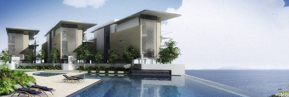
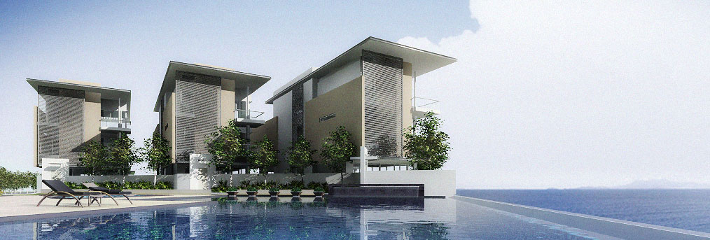
Personally, I preferred the 2nd shot. And I think, I could remove this "clutter" by adjusting the chairs and plants. But alas, this shot was rather "controversial." And to consider it artistic is subjective indeed. In the end, the client (like the majority) was more comfortable, and was drawn to the 1st shot. Nevertheless, I was satisfied that it took really sometime for some to consider the "best" image.


...so, the moral of the story is "you win some....you lose some." But at least dare to do the unusual, because "safe" can sometimes be "boring." (not that the 1st image was boring!)

Tech note: These images were simply "draft" renders. Lit in 3ds max, and rendered with Vray using one Direct Light. Some quick colour correction, brightness and contrast adjustment and background replacement were also done in Photoshop. -- only for "preview" purposes.